
These projects showcase my professional portfolio as a graphic designer for international companies across multiple industries. My work includes social media design, brand guidelines, packaging design, visualizations and photography, with a strong focus on clear visual systems, visual identity and storytelling. I combine creative design, consistency and adaptability to help brands communicate effectively online and offline.
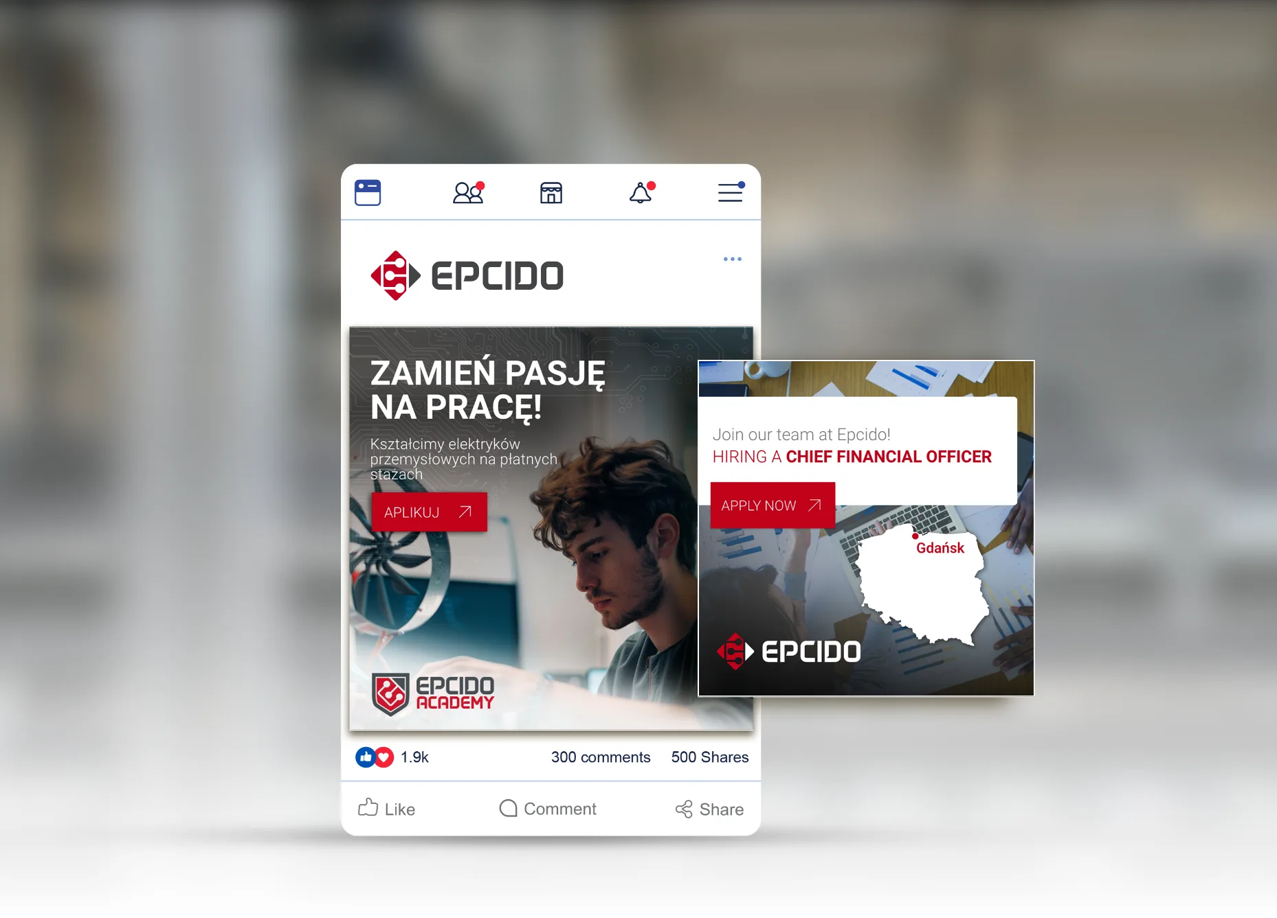
I worked for Epcido, a Polish-Danish company specializing in conveyor systems as well as electrical and mechanical installations for large international brands such as Tesla, IKEA and H&M. Epcido operates globally, sending skilled workers to industrial sites across Europe and beyond, with locations on several continents. As part of this collaboration, I designed visual templates for their social media, ensuring a clear, consistent and professional identity aligned with their international and industrial positioning.
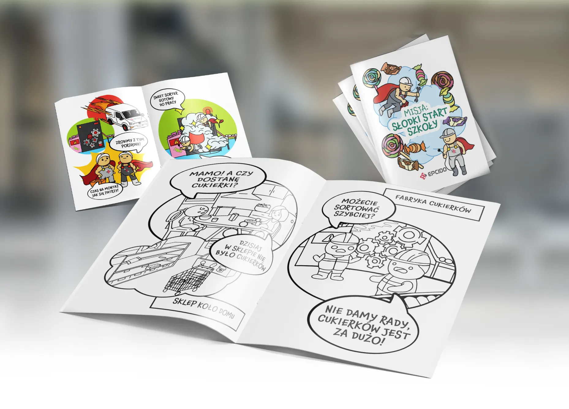
also created a children’s coloring book dedicated to the kids of Epcido’s electricians and mechanics who regularly travel abroad for work. The goal was to explain, in a simple and playful way, what their parents do and why their work is important. The story follows children on their first day of school, when sweets are missing because a candy factory has broken down — until the technicians step in to fix it. The illustrations are intentionally colorful, warm and child-friendly, and I initially developed a fully colored version to explore how the book could function as a small, appealing standalone publication.
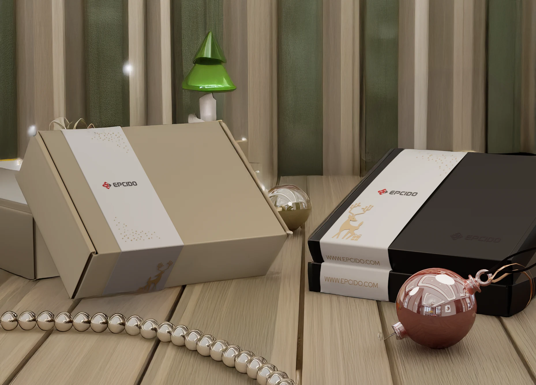
In parallel, I am working on packaging designs for Epcido’s Christmas gifts for employees. The visual direction follows a light, minimal and Scandinavian aesthetic, reflecting Epcido’s Danish roots and design sensibility. The focus is on simplicity, elegance and subtle details, creating packaging that feels both modern and thoughtful, while staying true to the company’s identity and values.
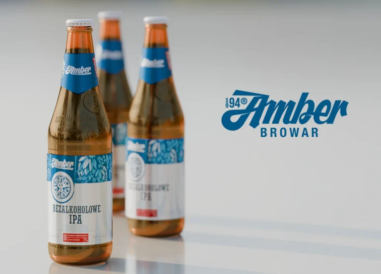
Browar Amber is a Polish craft brewery based in Gdańsk, known for its strong local identity and wide range of beers. I worked on this project in collaboration with Yazgot, a Polish marketing agency, contributing as a graphic designer across multiple media. My role covered DTP, beer packaging and labeling, social media visuals, photography, animation, and both 2D and 3D visualizations. The work required consistency across print and digital formats while respecting the brewery’s established visual language.
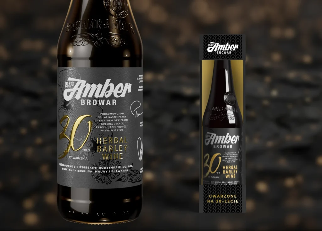
One of the key projects was the packaging design for Browar Amber’s 30th anniversary beer, a symbolic and important release for the brewery. I worked in detail on the label design, drawing specific graphic elements myself and carefully developing textures, typography, and composition. This bottle was meant to feel premium and commemorative while remaining consistent with the Amber brand. The project combined illustration, material research, and precise DTP execution.
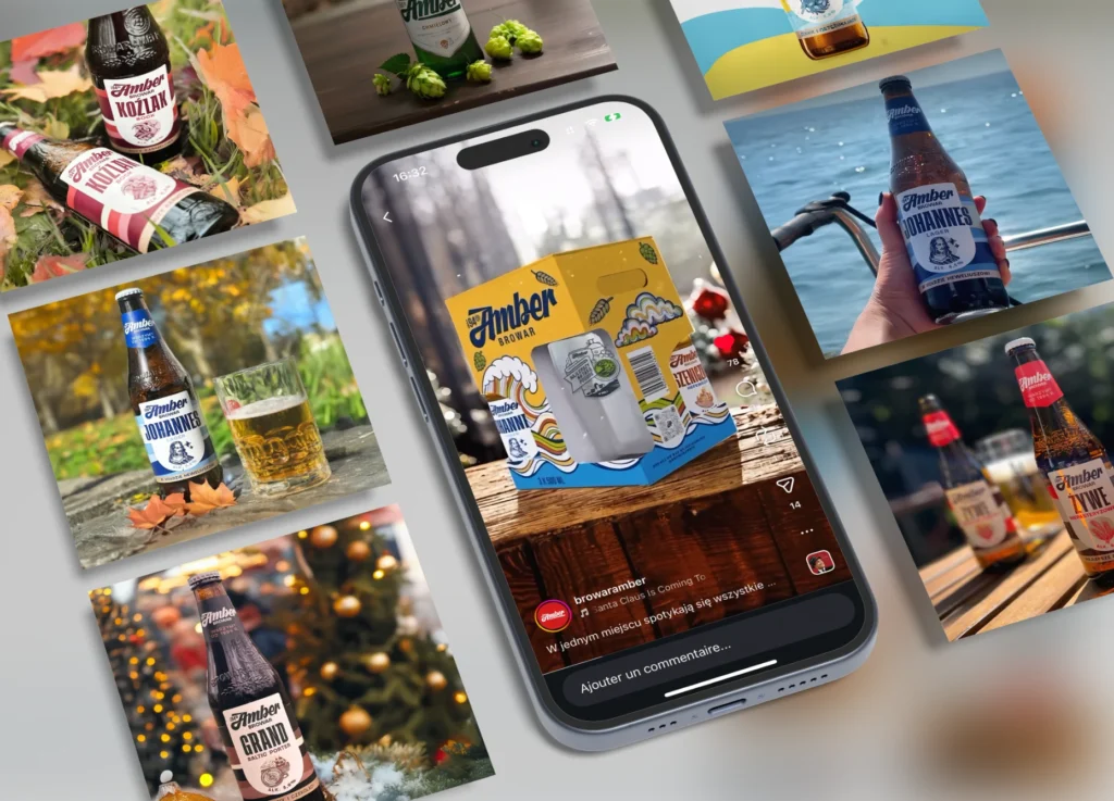
For social media, I created visuals adapted specifically for platforms such as Instagram, using animation and real-life photography to showcase the products in context. The goal was to translate the beer packaging identity into engaging digital content while maintaining clarity and recognizability on small screens. These visuals were designed to work within Amber’s social media strategy, balancing aesthetic appeal with product visibility.
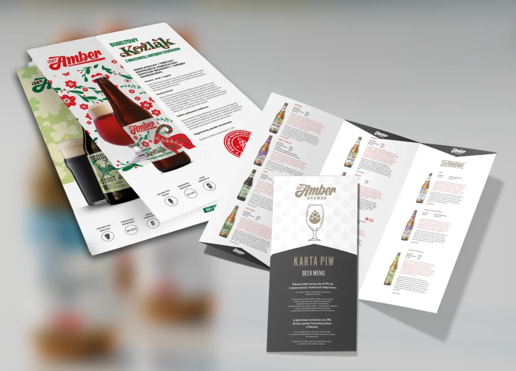
A significant part of my work involved DTP design for printed materials such as beer catalogs, beer menus, and informational layouts. These documents required clear hierarchy, readability, and visual consistency across multiple pages and formats. I worked on layout systems, typography, iconography, and print-ready files, ensuring that each document was functional for everyday use while staying aligned with the brand identity.
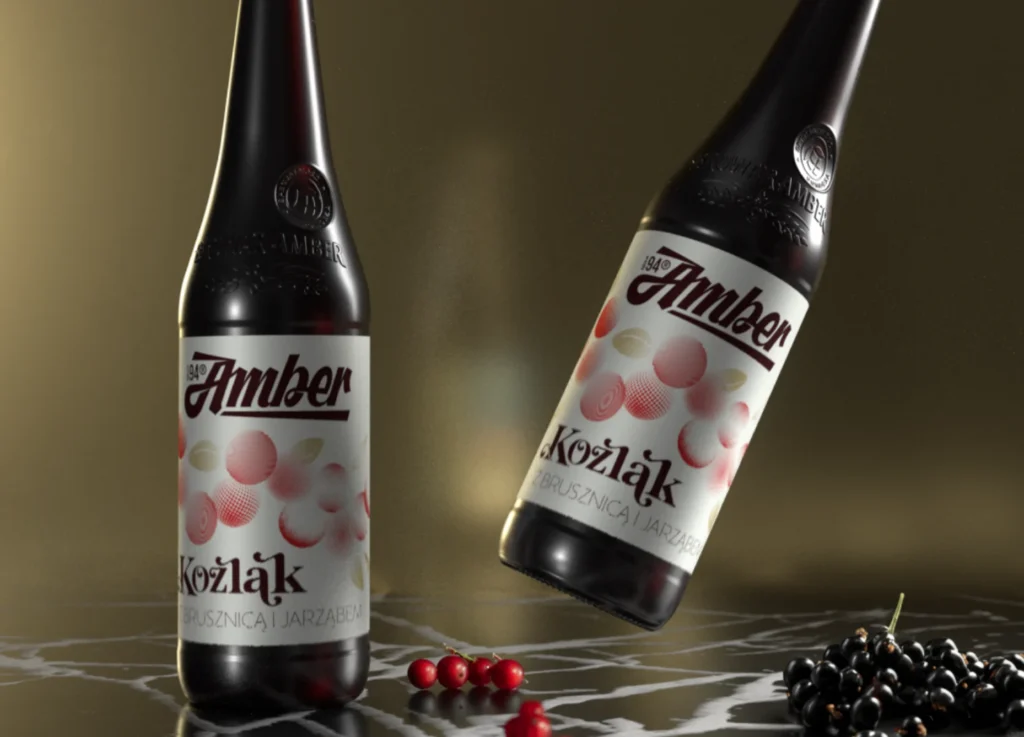
Alongside print and digital design, I produced both 2D and 3D visualizations to present Browar Amber’s products in a realistic and controlled environment. These visuals were used to preview packaging, labels, and materials before production, as well as to create high-quality assets for communication. Working in 3D allowed greater flexibility in lighting, textures, and compositions, while 2D visuals supported clarity and consistency across branding and marketing materials.
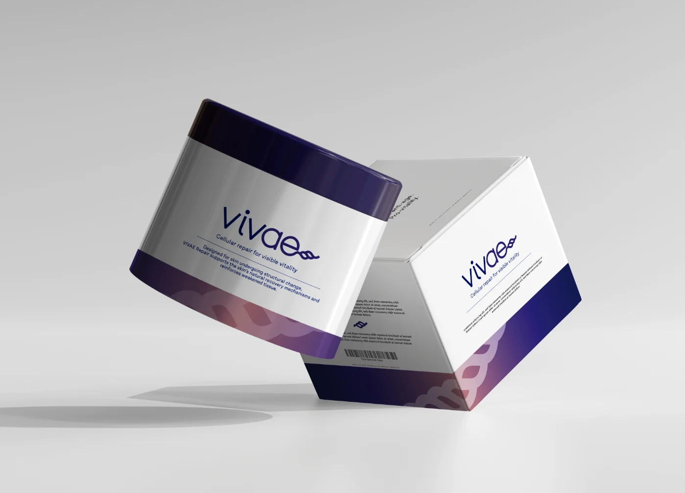
Vivae is a conceptual skincare brand imagined for a mature audience seeking science-driven beauty without the traditional anti-age narrative. The project explores the idea of pro-vitality — supporting the skin’s natural intelligence rather than fighting time.
The visual identity combines clinical precision with soft organic movement, translating scientific credibility into a contemporary and emotionally reassuring aesthetic. Inspired by cellular regeneration and living systems, the design language balances structure and fluidity to express evolution, continuity, and strength.
Through packaging, typography and color strategy, the project redefines scientific skincare as optimistic, elegant, and deeply human.
The visual identity is built as a coherent system combining clean typography, scientific clarity and fluid graphic accents inspired by biological forms. Every element — from layouts to color hierarchy — reinforces trust and continuity, creating a refined brand presence across communication materials.
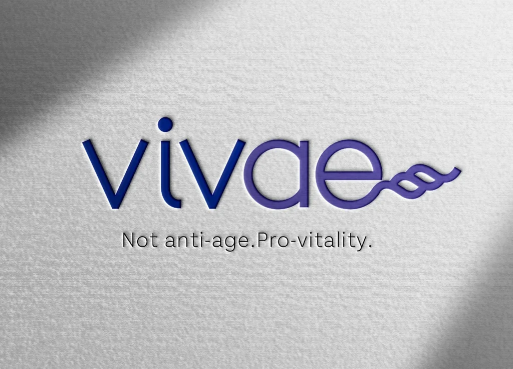
The Vivae logo reflects living motion and biological evolution. Its flowing form evokes continuity, regeneration and connection, translating the brand’s pro-vitality philosophy into a simple yet distinctive symbol. The result is a mark that feels both scientific and alive.
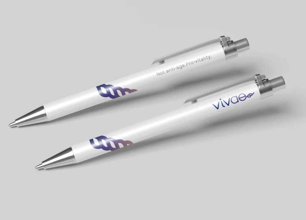
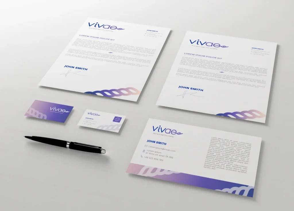
Brand extensions such as stationery and everyday objects help anchor the identity in real-world interactions. By applying the visual system across functional tools, the brand remains consistent, recognizable and quietly premium in every detail.
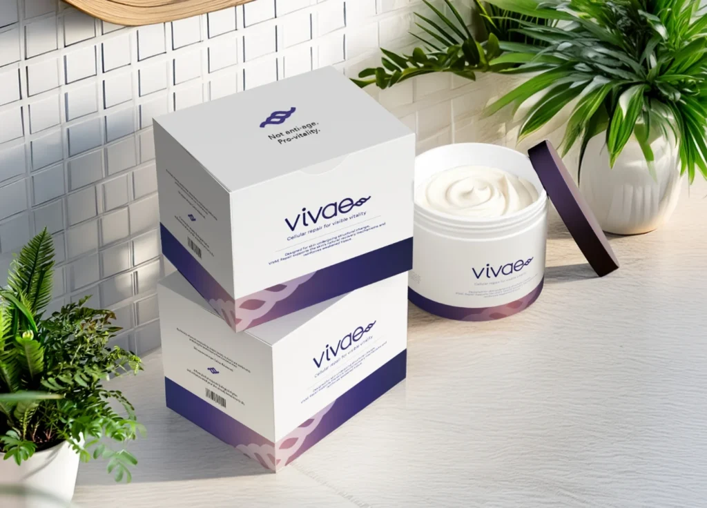
The packaging translates the brand concept into a tactile, everyday experience. Clean surfaces and organic curves create a dialogue between precision and care, allowing the products to feel both clinically credible and emotionally reassuring.
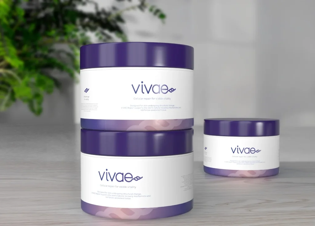
The product line is designed as a unified protocol, where consistent forms and colors create clarity while maintaining individual product recognition. The system supports a premium skincare experience that feels structured, calm and trustworthy.
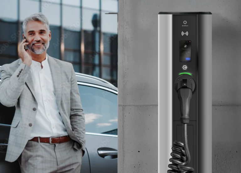
Enelion is a company specialized in electric vehicle charging solutions, operating at the intersection of technology, energy, and smart mobility. I worked on this project in collaboration with Yazgot, a Polish marketing agency. The visual identity relies on a minimalist and technological aesthetic, dominated by blue tones that convey reliability, precision, and innovation. The clean design language reflects Enelion’s focus on functionality, efficiency, and forward-thinking engineering.
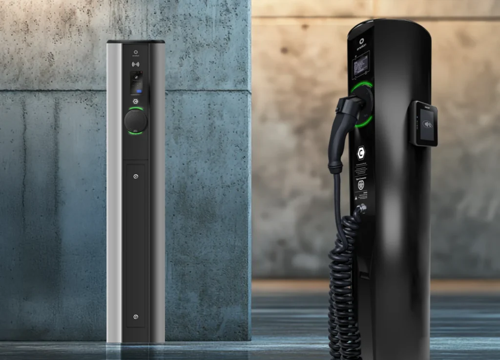
To present Enelion’s products clearly and consistently, I created both 2D and 3D visualizations using tools such as Blender, Photoshop, and Adobe Dimension. These visuals were developed for use on the website, in catalogs, and across marketing materials. Working in 3D allowed precise control over materials, lighting, and proportions, while 2D assets ensured clarity and adaptability across different communication formats.
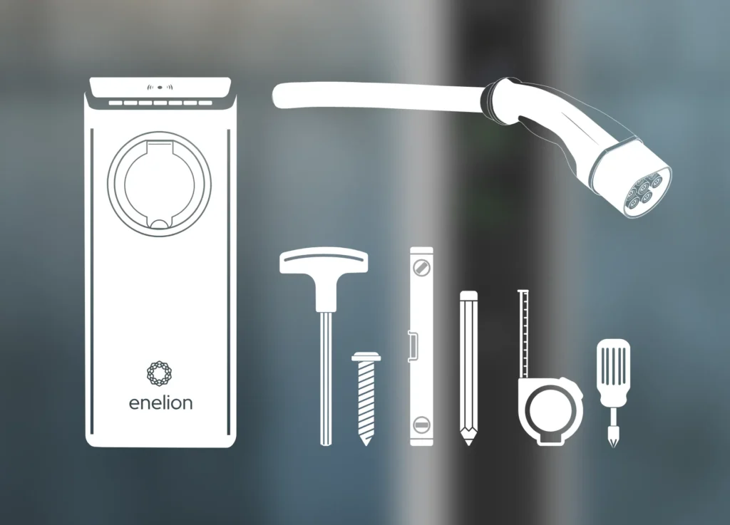
A key part of the project involved producing technical drawings, schematics, and instructional illustrations for packaging and user manuals. These visuals translate complex technical information into clear, understandable graphics. Accuracy and consistency were essential, as the drawings are directly used to explain product components, installation processes, and user interactions in a functional and accessible way.
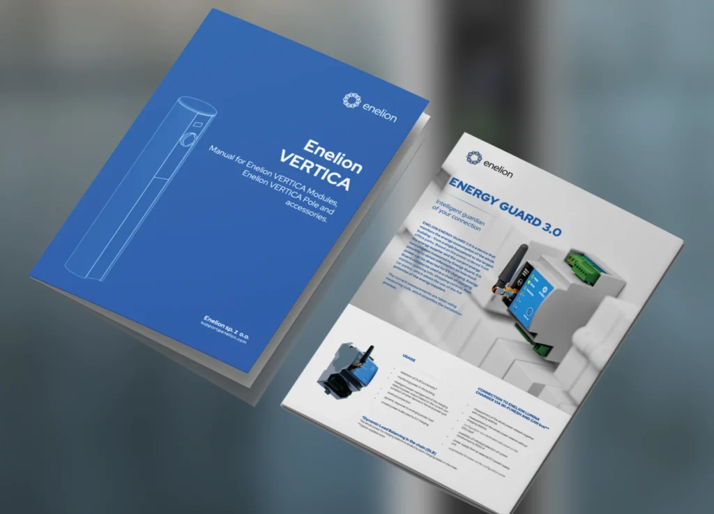
The project required extensive DTP work, particularly for technical documentation, catalogs, and manuals. This involved highly precise layout design, strict typographic hierarchy, and careful alignment of text, images, and diagrams. The challenge was to maintain absolute clarity and readability while staying consistent with Enelion’s minimalist visual identity, resulting in documents that are both technical and visually refined.
U Okulistek is an optician salon that combines medical care and retail, allowing patients to consult an ophthalmologist and then choose their glasses in the same place. Founded by three female doctors, the concept is built around trust, care, and approachability. I worked on this project in collaboration with Yazgot, a Polish marketing agency. The visual identity reflects a feminine and cozy atmosphere, designed to feel reassuring, modern, and welcoming rather than clinical.
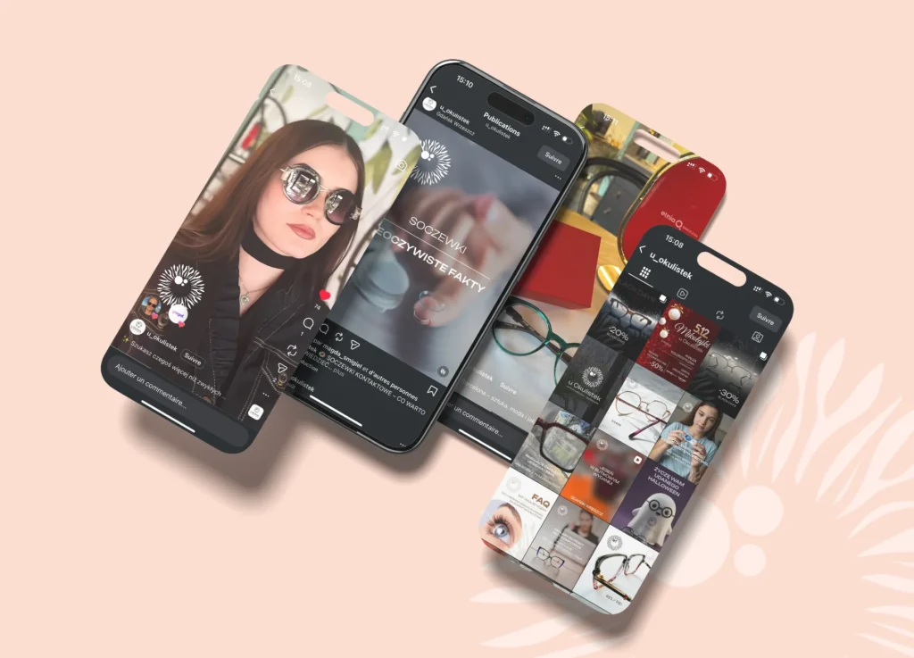
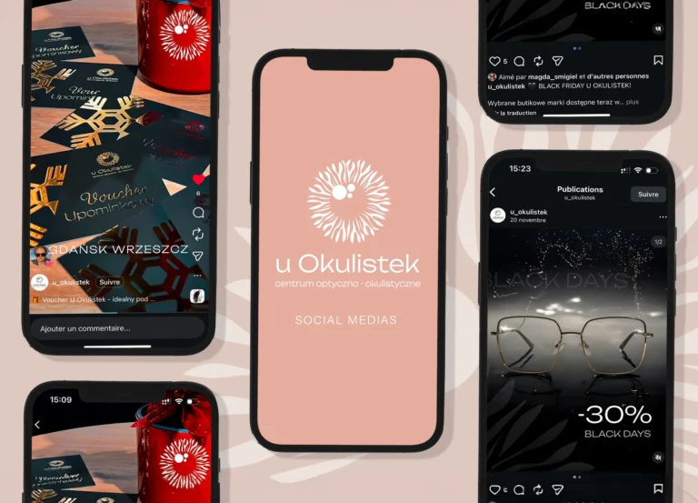
For social media, I created a variety of content including photos, videos, reels, and promotional posts adapted to Instagram. These visuals were designed to highlight everyday life at the salon, special events, seasonal promotions, and new collections. The goal was to balance professionalism with warmth, creating content that feels human and accessible while remaining visually consistent with U Okulistek’s soft and feminine identity.
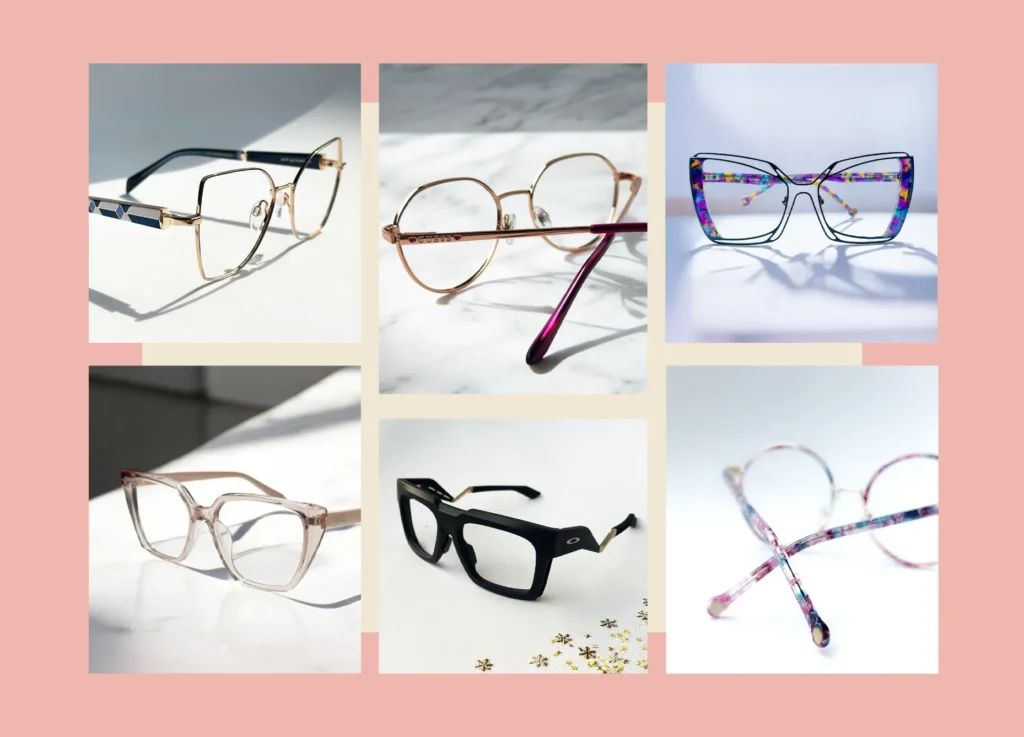
I also worked on professional product photo sessions focused on eyewear collections. These images were created specifically for use on Instagram and the U Okulistek website, emphasizing details, materials, and shapes of the frames. Clean compositions, soft lighting, and natural colors were used to showcase the products in a refined yet approachable way, aligning medical expertise with a lifestyle-oriented presentation.
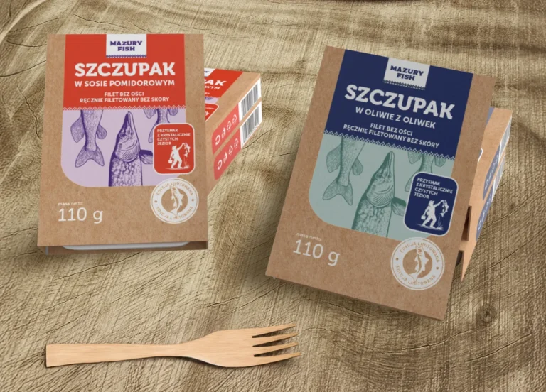
This packaging design was developed to highlight the artisanal and regional identity of Mazury Fish. The kraft paper base conveys naturalness and authenticity, while the bold color blocks clearly differentiate product variants, such as pike in oil and pike in tomato sauce. The illustrated fish motifs add a handcrafted, illustrative character, reinforcing the connection to traditional fishing and local production from the Mazury region.
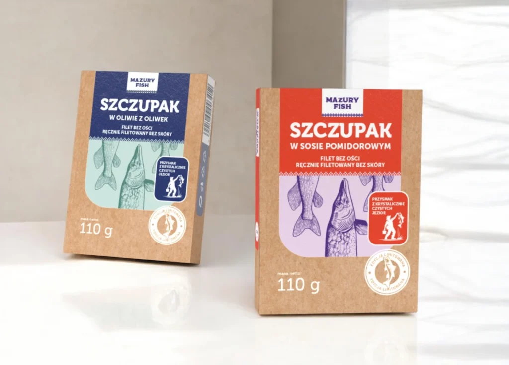
The design focuses on clarity and shelf impact through a balanced composition and strong color contrast. The structured layout ensures that key information—product name, weight, and origin—is immediately readable, while the restrained graphic system keeps the packaging clean and modern. The combination of minimal typography and illustration creates a contemporary reinterpretation of classic canned fish packaging.
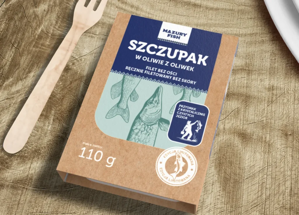
pecial attention was given to the tactile and visual experience of the product. The matte kraft texture combined with refined printed elements gives the packaging a premium yet approachable feel. The overall concept aims to communicate quality, transparency, and respect for tradition, positioning Mazury Fish as a modern brand rooted in regional heritage and simple, honest ingredients.
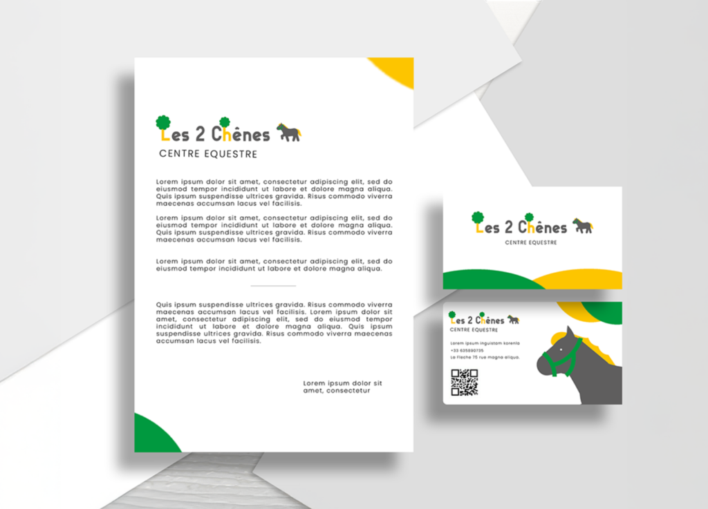
Les Deux Chênes is a horse riding facility in La Flèche, France, where children and parents can enjoy time with animals whilediscovering horse riding in a safe and fun environment. My main goal was there to provide Brand Guideline to create something directed towards children who are actually the main client of this horse riding facility.

Color is a key element of the visual identity of Les 2 Chênes, designed to convey a cheerful, playful, and welcoming atmosphere. In deliberate contrast to the muted, traditional codes often associated with equestrian stables, the palette embraces fresh, vibrant tones combined with natural hues inspired by the surrounding landscape. Soft greens reference nature and the rural environment, while warmer, brighter accents bring a sense of joy, optimism, and friendliness, particularly appealing to children. This colorful approach makes the riding center feel accessible and reassuring, transforming horse riding into a fun and engaging experience. The identity reflects the lively spirit of Les 2 Chênes and reinforces its role as a place of discovery, learning, and shared moments with animals.
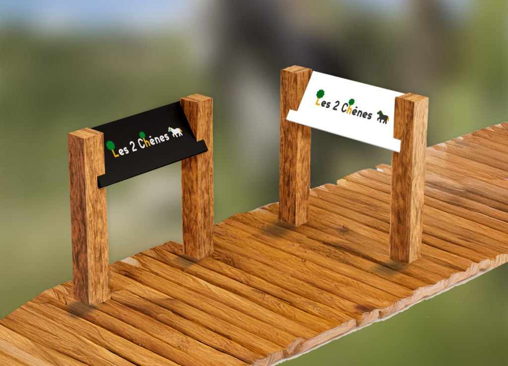
Cute, rounded shapes are used throughout the visual identity to create a soft and friendly impression. Their playful forms help make the brand feel approachable and child-friendly, reinforcing a sense of fun and warmth. The typography interacts with these shapes in a lively way, adding movement and personality while keeping the overall design clear and readable. The logo works seamlessly across different applications, from signage to equipment and accessories.

Cute, rounded shapes are used throughout the visual identity to create a soft and friendly impression. Their playful forms are echoed in the DTP layouts, where generous spacing, balanced compositions, and clear hierarchies ensure readability across print materials. The typography interacts dynamically with these shapes, adding movement and personality while remaining well-structured and functional for professional desktop publishing.
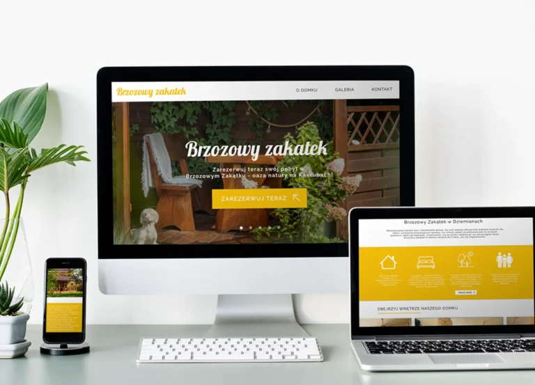
Brzozowy Zakątek is a website concept designed for a small countryside cottage in the Kaszuby region (named Brzozowy Zakątek), offering overnight stays for people looking to discover nature and slow tourism. The project was initially developed for a client of Yazgot, a Polish marketing agency, but was ultimately not selected. The concept focuses on creating a cheerful, welcoming atmosphere inspired by the surrounding landscape, using yellow and green tones drawn directly from nature.
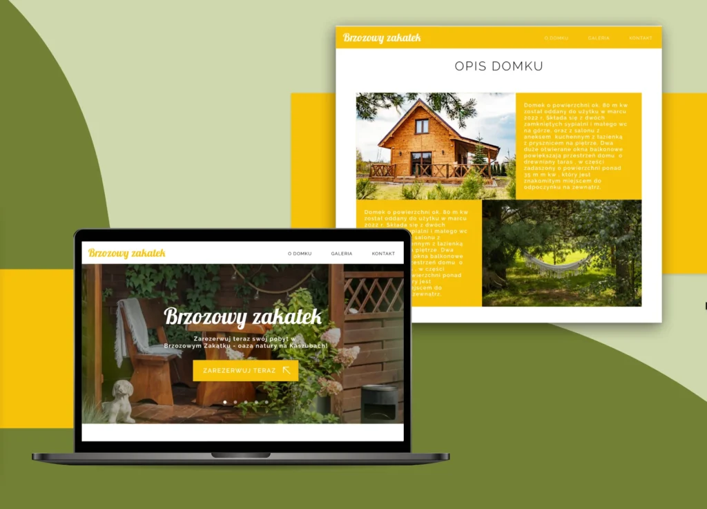
The desktop version of the website was designed to be clear, calm, and easy to navigate. Large visuals highlight the cottage and its natural environment, while a structured layout guides users toward essential information such as the description of the house, availability, and booking. The color palette reinforces the connection to nature, combining warm yellows with soft greens to create a relaxed and inviting browsing experience
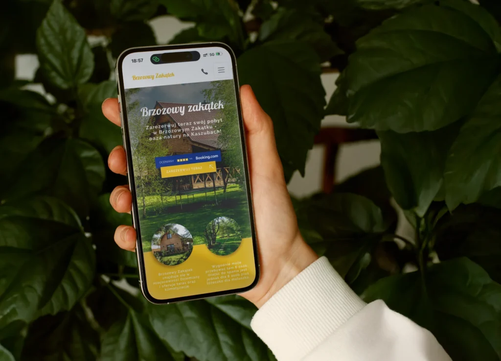
The mobile version was designed with simplicity and accessibility in mind, ensuring a smooth experience on smaller screens. Key information is immediately visible, with clear call-to-action buttons and intuitive navigation. The visual identity remains consistent with the desktop version, maintaining the same natural color palette and friendly tone, allowing users to easily explore the cottage and book their stay while on the go.
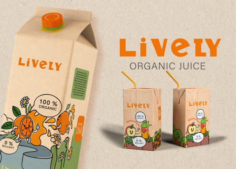
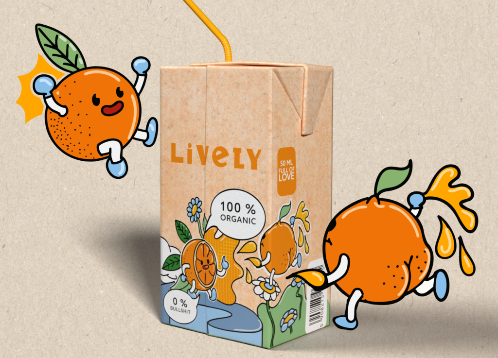
Vibrant colors and expressive fruit characters are at the core of Lively’s visual identity. The playful illustrations add movement and personality to the packaging, creating an energetic and friendly universe that instantly communicates freshness and organic values. Bold outlines and joyful color combinations help the product stand out while making the brand feel accessible, fun, and full of life.
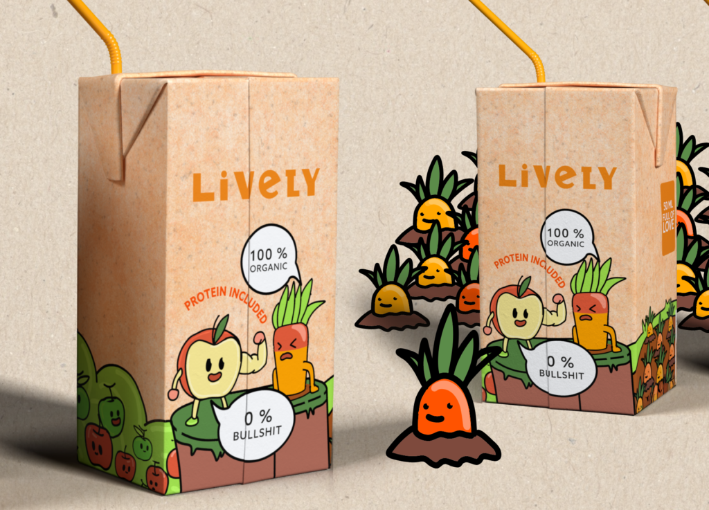
The packaging system was designed to remain consistent across different formats while allowing strong visual variation. Color plays a key role in differentiating products, supported by modular illustrations that adapt to each pack size. This flexible system ensures clear shelf recognition while maintaining a cohesive and lively brand identity across the entire range.
Lively challenges traditional organic packaging by embracing a pop-art inspired and humorous approach. Clean layouts, bold typography, and playful graphics create a strong visual impact without losing clarity or readability. The design proves that organic products can be expressive, modern, and approachable, while staying true to their natural values.
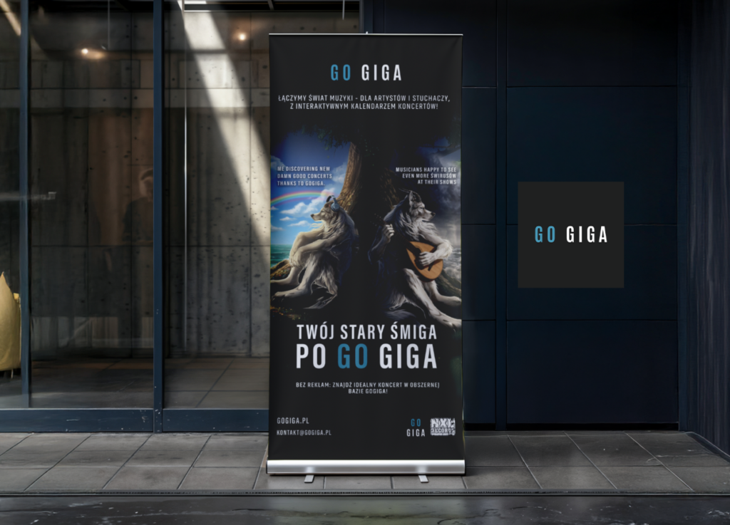
This poster was designed to be instantly eye-catching by deliberately embracing pop culture and internet meme codes. The wolf, a well-known meme figure, is used with irony rather than seriousness, creating a visual that feels both familiar and slightly absurd. Created for GO GIGA, a platform promoting musicians, the design plays with exaggerated imagery and bold typography to stand out while remaining accessible.
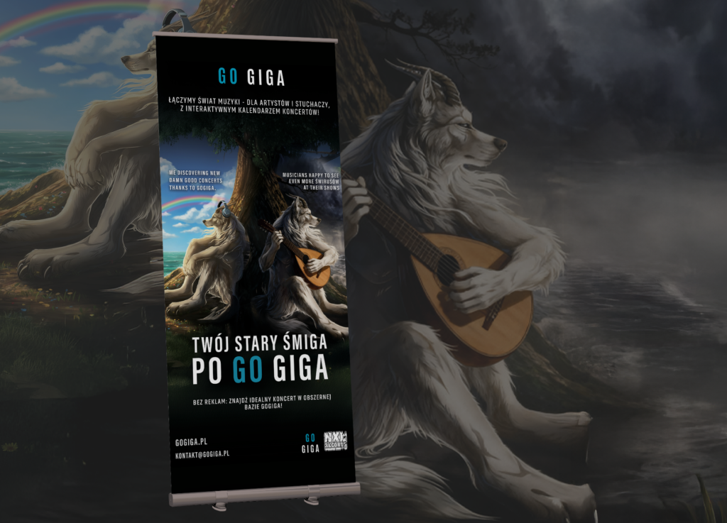
Placed in an urban setting, the poster highlights the contrast between serious public advertising formats and ironic meme imagery. The familiar wolf immediately disrupts expectations, catching attention before revealing its message. Designed for GO GIGA, a platform that helps music fans find live concerts through an intuitive calendar, the poster bridges online humor and offline communication with a conscious wink.
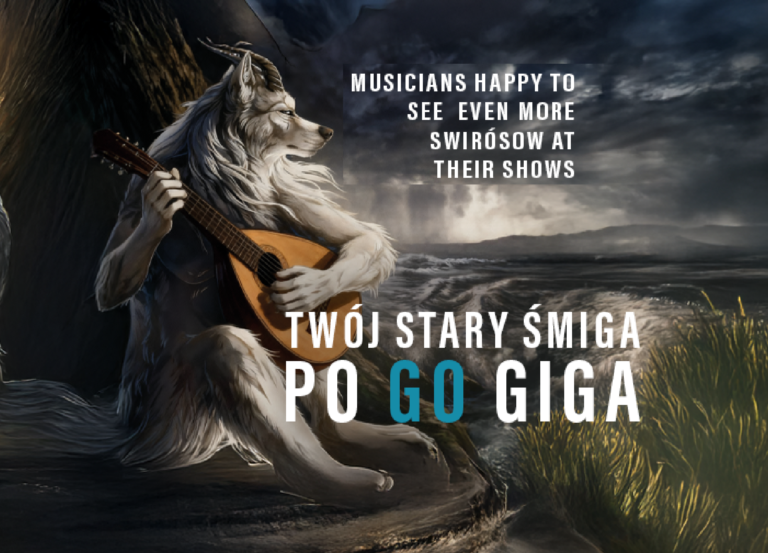
Here, the wolf is intentionally staged as an over-dramatic musician, turning a common internet meme into a playful visual metaphor. The contrast between epic imagery and its ironic intent creates a humorous tension that invites viewers to look twice. By blending meme culture with music references, the poster speaks directly to a digitally native audience used to irony, remix, and visual exaggeration.
I worked for Epcido, a Polish-Danish company specializing in conveyor systems as well as electrical and mechanical installations for large international brands such as Tesla, IKEA and H&M. Epcido operates globally, sending skilled workers to industrial sites across Europe and beyond, with locations on several continents. As part of this collaboration, I designed visual templates for their social media, ensuring a clear, consistent and professional identity aligned with their international and industrial positioning.
I also created a children’s coloring book dedicated to the kids of Epcido’s electricians and mechanics who regularly travel abroad for work. The goal was to explain, in a simple and playful way, what their parents do and why their work is important. The story follows children on their first day of school, when sweets are missing because a candy factory has broken down — until the technicians step in to fix it. The illustrations are intentionally colorful, warm and child-friendly, and I initially developed a fully colored version to explore how the book could function as a small, appealing standalone publication.
In parallel, I am working on packaging designs for Epcido’s Christmas gifts for employees. The visual direction follows a light, minimal and Scandinavian aesthetic, reflecting Epcido’s Danish roots and design sensibility. The focus is on simplicity, elegance and subtle details, creating packaging that feels both modern and thoughtful, while staying true to the company’s identity and values.
Browar Amber is a Polish craft brewery based in Gdańsk, known for its strong local identity and wide range of beers. I worked on this project in collaboration with Yazgot, a Polish marketing agency, contributing as a graphic designer across multiple media. My role covered DTP, beer packaging and labeling, social media visuals, photography, animation, and both 2D and 3D visualizations. The work required consistency across print and digital formats while respecting the brewery’s established visual language.
One of the key projects was the packaging design for Browar Amber’s 30th anniversary beer, a symbolic and important release for the brewery. I worked in detail on the label design, drawing specific graphic elements myself and carefully developing textures, typography, and composition. This bottle was meant to feel premium and commemorative while remaining consistent with the Amber brand. The project combined illustration, material research, and precise DTP execution.
For social media, I created visuals adapted specifically for platforms such as Instagram, using animation and real-life photography to showcase the products in context. The goal was to translate the beer packaging identity into engaging digital content while maintaining clarity and recognizability on small screens. These visuals were designed to work within Amber’s social media strategy, balancing aesthetic appeal with product visibility.
A significant part of my work involved DTP design for printed materials such as beer catalogs, beer menus, and informational layouts. These documents required clear hierarchy, readability, and visual consistency across multiple pages and formats. I worked on layout systems, typography, iconography, and print-ready files, ensuring that each document was functional for everyday use while staying aligned with the brand identity.
Alongside print and digital design, I produced both 2D and 3D visualizations to present Browar Amber’s products in a realistic and controlled environment. These visuals were used to preview packaging, labels, and materials before production, as well as to create high-quality assets for communication. Working in 3D allowed greater flexibility in lighting, textures, and compositions, while 2D visuals supported clarity and consistency across branding and marketing materials.
Vivae is a conceptual skincare brand imagined for a mature audience seeking science-driven beauty without the traditional anti-age narrative. The project explores the idea of pro-vitality — supporting the skin’s natural intelligence rather than fighting time.
The visual identity combines clinical precision with soft organic movement, translating scientific credibility into a contemporary and emotionally reassuring aesthetic. Inspired by cellular regeneration and living systems, the design language balances structure and fluidity to express evolution, continuity, and strength.
Through packaging, typography and color strategy, the project redefines scientific skincare as optimistic, elegant, and deeply human.
The visual identity is built as a coherent system combining clean typography, scientific clarity and fluid graphic accents inspired by biological forms. Every element — from layouts to color hierarchy — reinforces trust and continuity, creating a refined brand presence across communication materials.
The Vivae logo reflects living motion and biological evolution. Its flowing form evokes continuity, regeneration and connection, translating the brand’s pro-vitality philosophy into a simple yet distinctive symbol. The result is a mark that feels both scientific and alive.
Brand extensions such as stationery and everyday objects help anchor the identity in real-world interactions. By applying the visual system across functional tools, the brand remains consistent, recognizable and quietly premium in every detail.
The packaging translates the brand concept into a tactile, everyday experience. Clean surfaces and organic curves create a dialogue between precision and care, allowing the products to feel both clinically credible and emotionally reassuring.
The product line is designed as a unified protocol, where consistent forms and colors create clarity while maintaining individual product recognition. The system supports a premium skincare experience that feels structured, calm and trustworthy.
This packaging design was developed to highlight the artisanal and regional identity of Mazury Fish. The kraft paper base conveys naturalness and authenticity, while the bold color blocks clearly differentiate product variants, such as pike in oil and pike in tomato sauce. The illustrated fish motifs add a handcrafted, illustrative character, reinforcing the connection to traditional fishing and local production from the Mazury region.
The design focuses on clarity and shelf impact through a balanced composition and strong color contrast. The structured layout ensures that key information—product name, weight, and origin—is immediately readable, while the restrained graphic system keeps the packaging clean and modern. The combination of minimal typography and illustration creates a contemporary reinterpretation of classic canned fish packaging.
Special attention was given to the tactile and visual experience of the product. The matte kraft texture combined with refined printed elements gives the packaging a premium yet approachable feel. The overall concept aims to communicate quality, transparency, and respect for tradition, positioning Mazury Fish as a modern brand rooted in regional heritage and simple, honest ingredients.
Enelion is a company specialized in electric vehicle charging solutions, operating at the intersection of technology, energy, and smart mobility. I worked on this project in collaboration with Yazgot , a Polish marketing agency. The visual identity relies on a minimalist and technological aesthetic, dominated by blue tones that convey reliability, precision, and innovation. The clean design language reflects Enelion’s focus on functionality, efficiency, and forward-thinking engineering.
To present Enelion’s products clearly and consistently, I created both 2D and 3D visualizations using tools such as Blender, Photoshop, and Adobe Dimension . These visuals were developed for use on the website, in catalogs, and across marketing materials. Working in 3D allowed precise control over materials, lighting, and proportions, while 2D assets ensured clarity and adaptability across different communication formats.
A key part of the project involved producing technical drawings, schematics, and instructional illustrations for packaging and user manuals. These visuals translate complex technical information into clear, understandable graphics. Accuracy and consistency were essential, as the drawings are directly used to explain product components, installation processes, and user interactions in a functional and accessible way.
The project required extensive DTP work , particularly for technical documentation, catalogs, and manuals. This involved highly precise layout design, strict typographic hierarchy, and careful alignment of text, images, and diagrams. The challenge was to maintain absolute clarity and readability while staying consistent with Enelion’s minimalist visual identity, resulting in documents that are both technical and visually refined.
For social media, I created a variety of content including photos, videos, reels, and promotional posts adapted to Instagram. These visuals were designed to highlight everyday life at the salon, special events, seasonal promotions, and new collections. The goal was to balance professionalism with warmth, creating content that feels human and accessible while remaining visually consistent with U Okulistek’s soft and feminine identity.
I also worked on professional product photo sessions focused on eyewear collections. These images were created specifically for use on Instagram and the U Okulistek website, emphasizing details, materials, and shapes of the frames. Clean compositions, soft lighting, and natural colors were used to showcase the products in a refined yet approachable way, aligning medical expertise with a lifestyle-oriented presentation.
Vibrant colors and expressive fruit characters are at the core of Lively’s visual identity. The playful illustrations add movement and personality to the packaging, creating an energetic and friendly universe that instantly communicates freshness and organic values. Bold outlines and joyful color combinations help the product stand out while making the brand feel accessible, fun, and full of life.
The packaging system was designed to remain consistent across different formats while allowing strong visual variation. Color plays a key role in differentiating products, supported by modular illustrations that adapt to each pack size. This flexible system ensures clear shelf recognition while maintaining a cohesive and lively brand identity across the entire range.
Lively challenges traditional organic packaging by embracing a pop-art inspired and humorous approach. Clean layouts, bold typography, and playful graphics create a strong visual impact without losing clarity or readability. The design proves that organic products can be expressive, modern, and approachable, while staying true to their natural values.
Les Deux Chênes is a horse riding facility in La Flèche, France, where children and parents can enjoy time with animals whilediscovering horse riding in a safe and fun environment. My main goal was there to provide Brand Guideline to create something directed towards children who are actually the main client of this horse riding facility
Color is a key element of the visual identity of Les 2 Chênes, designed to convey a cheerful, playful, and welcoming atmosphere. In deliberate contrast to the muted, traditional codes often associated with equestrian stables, the palette embraces fresh, vibrant tones combined with natural hues inspired by the surrounding landscape. Soft greens reference nature and the rural environment, while warmer, brighter accents bring a sense of joy, optimism, and friendliness, particularly appealing to children.
Cute, rounded shapes are used throughout the visual identity to create a soft and friendly impression. Their playful forms help make the brand feel approachable and child-friendly, reinforcing a sense of fun and warmth. The typography interacts with these shapes in a lively way, adding movement and personality while keeping the overall design clear and readable. The logo works seamlessly across different applications, from signage to equipment and accessories.
Cute, rounded shapes are used throughout the visual identity to create a soft and friendly impression. Their playful forms are echoed in the DTP layouts, where generous spacing, balanced compositions, and clear hierarchies ensure readability across print materials. The typography interacts dynamically with these shapes, adding movement and personality while remaining well-structured and functional for professional desktop publishing.
Brzozowy Zakątek is a website concept designed for a small countryside cottage in the Kaszuby region (named Brzozowy Zakątek), offering overnight stays for people looking to discover nature and slow tourism. The project was initially developed for a client of Yazgot , a Polish marketing agency, but was ultimately not selected. The concept focuses on creating a cheerful, welcoming atmosphere inspired by the surrounding landscape, using yellow and green tones drawn directly from nature.
The desktop version of the website was designed to be clear, calm, and easy to navigate. Large visuals highlight the cottage and its natural environment, while a structured layout guides users toward essential information such as the description of the house, availability, and booking. The color palette reinforces the connection to nature, combining warm yellows with soft greens to create a relaxed and inviting browsing experience
The mobile version was designed with simplicity and accessibility in mind, ensuring a smooth experience on smaller screens. Key information is immediately visible, with clear call-to-action buttons and intuitive navigation. The visual identity remains consistent with the desktop version, maintaining the same natural color palette and friendly tone, allowing users to easily explore the cottage and book their stay while on the go.